Archive for the ‘ Identidad de Marca. Productos ’ Category

Lanzamiento Taller 5A

Este video ha sido exhibido como soporte para la presentación del nivel 5 de la Cátedra A de Taller de Diseño en Comunicación Visual, FBA, UNLP. Realización: Martín Hoare & Mariela D’Angelo. Music by Lullatone.
Los trabajos que se exponen en el mismo fueron desarrollados en el marco del taller, y pertenecen a los alumnos: Rocio Delaloye (2012), Macarena Fernandez Coria (2012), Lucia Mendivil (2012), Rocio Giorgi (2012), Damián Constantino (2012), Maria Emilia Fiorincino (2011), Rocio Lofiego (2011), Maria Jose Prenassi (2010) y Candela Polo (2010).
Cátedra A. Taller de Diseño en Comunicación Visual. UNLP. Prof. Titular: Juan Tegiacchi.

Estudio de casos. Encuentro Jue. 12|08

En esta oportunidad les dejamos los links que derivan al material que empleamos para armar la clase del  Jueves 12 bajo el tópico “Desarrollo de Packaging. Prototipos” (alumnos con proyectos vinculados a temática del Nivel 2). Los invitamos a colaborar con cualquier material interesante que encuentren sobre la temática y quieran compartir con el resto.

· · · · · · · · · · · · · · · ·

Au lait (por Warissara Muangsaen)

http://www.thedieline.com/blog/2010/7/27/student-spotlight-au-lait.html

· · · · · · · · · · · · · · · ·

Belvedere (por Lucía Picerno)

http://www.thedieline.com/blog/2009/12/1/student-spotlight-lucia-picerno-belvedere.html

· · · · · · · · · · · · · · · ·

Tea pot (por Nadia Arioui Salinas)

http://www.thedieline.com/blog/2010/6/2/student-spotlight-teapot.html

· · · · · · · · · · · · · · · ·

Folgers (por Noah Love)

http://www.thedieline.com/blog/2010/2/2/student-spotlight-noah-love.html

· · · · · · · · · · · · · · · ·

Oatrageous! (por José Luis García Eguiguren)

http://www.thedieline.com/blog/2010/5/12/student-spotlight-oatrageous.html

· · · · · · · · · · · · · · · ·

Death by chocolate (por Denise Franke)

http://www.thedieline.com/blog/2010/2/2/student-spotlight-death-by-chocolate.html

· · · · · · · · · · · · · · · ·

Juan Federico Rojas frozen meals (por Carolina Vargas)

http://www.thedieline.com/blog/2010/4/22/student-spotlight-juan-federico-rojas-frozen-meals.html

· · · · · · · · · · · · · · · ·

Gordon Ramsay line (por José Luis García Eguiguren)

http://www.thedieline.com/blog/2010/2/12/student-spotlight-gordon-ramsay-line.html

· · · · · · · · · · · · · · · ·

San Miguel (por Eren Saracevic)

http://www.thedieline.com/blog/2010/1/2/student-spotlight-eren-saracevic.html

· · · · · · · · · · · · · · · ·

Next generation Coke packaging (por Andrew Kim)

http://www.thedieline.com/blog/2010/3/26/student-spotlight-next-generation-coke-packaging.html

http://designfabulous.blogspot.com/2010/03/eco-coke-bottle-design.html

· · · · · · · · · · · · · · · ·

Patagonia finest teas (por Valeria Moreiro)

http://minnima.99k.org/index.php?/design/tea–sis/

Estudio de casos. Encuentro Jue. 08|07

Hola a todos, les comentamos que en estos posteos vamos a ir poniendo links que derivan a algo del material que empleamos para armar las clases de tópicos en el Eje Proyecto. El tópico del Jueves 08 ha sido «Campañas»; en esta oportunidad les dejamos links a los chicos que desarrollan su eje sobre temática del Nivel 2. Es más que bienvenido cualquier material interesante que encuentren sobre campañas y quieran compartir con el resto.
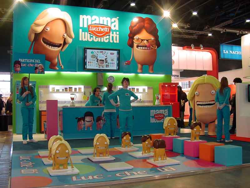
Mamá Lucchetti

Campaña: Mamá Lucchetti
Client: Molinos
Agency: Madre
Tópico publicitario: humor

> Concept (desde infobrand)
http://www.infobrand.com.ar/notas/13197-Luchetti%3A-el-triunfo-de-la-antihero%EDna

· · · · · · · · · · · · · · · ·

> Character design & kitchen design process/ comerciales televisivos (by Pepper Melon)

http://www.peppermelon.tv/projects/lucchetti.html

> Comerciales televisivos (by Reino)

Master of The Sopa: http://reinobuenosaires.com/work/i/lucchetti-mastersopas.html

Caldos: http://reinobuenosaires.com/work/i/lucchetti-caldos.html

Stickers: http://reinobuenosaires.com/work/i/lucchetti-stickers.html

· · · · · · · · · · · · · · · ·

> Gráfica & promo Mamá Lucchetti

Caldos: http://www.creativosenred.com/_Images/Piezas/Imagenes/1203/Lucchetti_-_Caldos_(1)0408.jpg

Sopas: http://3.bp.blogspot.com/_M3OgGaAPNSo/SlJYq2hvboI/AAAAAAAANII/EtZjr8j4eUc/s1600-h/madre-ar-lucchettisopas.jpg

Promo Mamá Lucchetti (by Bosque): http://holabosque.com.ar/2010/04/15/promo-mama-lucchetti-2/

· · · · · · · · · · · · · · · ·

> Stand/ Memotest y otros soportes interactivos (by Estado Lateral)

http://www.todoenunclick.com/Notas/Imagenes/Stand-Lucchetti-Rural-09.jpg

http://www.flickr.com/photos/i2offplusr3nder/3798411098/

http://www.flickr.com/photos/i2offplusr3nder/3798411384/

http://www.flickr.com/photos/i2offplusr3nder/3798410386/

http://www.flickr.com/photos/i2offplusr3nder/3798412818/

· · · · · · · · · · · · · · · ·

Cadbury

Campaña: Chocolatómetro
Client: Cadbury Stani Argentina
Agency: Del Campo Nazca Saatchi & Saatchi
Tópico publicitario: humor

> Concept (desde infobrand)

http://www.infobrand.com.ar/notas/12673-Cadbury-estrena-agencia-con-el-chocolat%F3metro

· · · · · · · · · · · · · · · ·

> Comerciales televisivos

La cuenta: http://www.youtube.com/watch#!v=XPfocOcEbzI&feature=related

Tenés razón: http://www.youtube.com/watch#!v=FW1odWQLAig&feature=related

Shh!: http://www.youtube.com/watch#!v=OuNeqp7sfAw&feature=related

Cadbury antes del chocolatómetro: comercial Cadbury Reinas (descargar video que figura al pie del site): http://www.cadbury.com.ar/Marca_Detalhe.aspx?id=117

· · · · · · · · · · · · · · · ·

Doritos

Campaña: Lleguemos a la segunda salida
Client: Doritos
Agency: BBDO Argentina

> Concept (desde Mercado)

http://www.mercado.com.ar/nota.php?id=360867

· · · · · · · · · · · · · · · ·

> Comerciales televisivos/ nota en La Nación

http://www.lanacion.com.ar/nota.asp?nota_id=1120932

· · · · · · · · · · · · · · · ·

> Video resumen (presentación y explicación de campaña)/ otras piezas e intervenciones (by bbdo Arg)

http://www.bbdoargentina.com/digital/doritos_myspace.html

· · · · · · · · · · · · · · · ·

Got Milk?

Campaña: Milk Mustache/ Body by Milk
Client: California Milk Processor board
Agency: Goodby Silverstein and Partners (original 1993)/ Lowe NY/ otras

> Concept (desde elpoderdelasideas)

http://elpoderdelasideas.com/anuncios-tv/¿tienes-leche-retrospectiva/

· · · · · · · · · · · · · · · ·

> Websites/ campaña gráfica/ aplicaciones interactivas

Body by Milk http://www.bodybymilk.com/

Got Milk? http://www.gotmilk.com/

Why milk? http://www.whymilk.com/

· · · · · · · · · · · · · · · ·

> Algunos comerciales televisivos

live well (2009/ 2010): http://www.youtube.com/watch?v=3RY8YPckczc

pass the gallon (2009/2010): http://www.youtube.com/user/MilkMustacheCampaign#p/a/u/1/HmtlnLk4N-E

La llorona (2004): http://www.youtube.com/watch#!v=erhsuXTyDww&feature=related

Mr. Miller: http://www.youtube.com/watch#!v=82yZVB7IDlE&feature=related

Elderly got milk?: http://www.youtube.com/watch#!v=1zJg-V704AY&feature=related

Insolation: http://www.youtube.com/watch#!v=mMnE04gpAvo&feature=related

Birthday cake: http://www.youtube.com/watch?v=IJHxsAhjKAA

Desserts (1996): http://www.youtube.com/watch#!v=jRDo2tDdiY0&feature=related

Where am I? (1995): http://www.youtube.com/watch#!v=hnIjgw5A-iI&feature=related

Body cast (1995): http://www.youtube.com/watch#!v=NKllfrSvrE0&feature=related

Raging Santa: http://www.youtube.com/watch#!v=sF3G9kTeacw&feature=related

30 creativos y originales diseños de etiqueta de vino

Desde thecoolist.com

Amazing Wine Labels – El diseño de la etiqueta del vino puede hacer o romper el éxito de un vino nuevo introducido en el mercado. Incluso más allá de la calidad del vino en sí, la etiqueta juega un papel primordial en las decisiones de compra de los clientes. Es base a este hecho es que muchos diseñadores gráficos han centrado su atención en potenciar el ejercicio creativo, realizando gráfica de productos que conectan una botella de vino con su comprador de una manera muy particular (…) Leer más

50 ingeniosos diseños de Packaging

Desde pelfusion.com

Hay un viejo adagio que dice: «No juzgues a un libro por su portada». Pero, en un mundo donde hay miles de competidores para tal o cual producto específico, esto deja de ser cierto. Crecemos en una sociedad en donde por lo general, el aspecto es lo que se percibe como lo más importante, y en esta instancia, resulta totalmente cierto.
Por lo general, los consumidores tienden a ir de forma automática hacia un producto cuando el envase de éste es más interesante o atractivo que el de los productos aledaños. Los diseñadores intentan todo para hacer que sus productos destaquen más. Es para ayudarlos a ellos que hemos escogido lo que denominamos los 50 mejores diseños de envases; aquellos que se destacan e incitan a los consumidores a la compra (…) Leer más

16 Procesos de Diseño de logos

Desde thedesigncubicle.com

Como diseñador de branding siempre he disfrutado de ver y de leer el pensamiento y los procesos creativos de otros diseñadores gráficos dedicados al diseño de logos – desde el resumen del proyecto, a los bocetos iniciales, hasta los toques finales- . La comprensión de cómo los diseñadores de logos trabajan y expresar sus ideas es una gran manera de aprender y ampliar nuestra propia creatividad. Más importante aún, de comprender el valor del esfuerzo del proceso de diseño y apreciar el arte del diseño del logotipo.

A continuación, presento 16 procesos de diseño de logos a cargo de mis colegas y diseñadores predilectos (…) Leer más


Caso de Estudio: la NBC

Desde Capacity.tv

We had the honor once again of taking part in shaping the look and feel of one of the most recognizable television brands in the world. This time around, the process got even more interesting and involved than in past years because of some new internal thinking. We’ve broken it down into a detailed case study to try to make sense of everything. Feel free to just scroll and look at the pictures, or come along for a nuanced journey into the process if you’re feeling adventurous. ; )

PITCH PHASE

Before we got involved in the project, months of research happened internally at NBC with the intention of finding and defining the brand voice and positioning. We were briefed on the internal study, which was about what you’d expect with the exception of being surprisingly refreshing. In fact, we found it to be quite inspiring and open-ended, and we thought we would be able to help them figure out how to apply it to the brand in a visual way, rooted in concept… so we decided to pitch.

The pitch was pretty elaborate, involving about 12 separate entities. Some were focused more on the design and some were focused more specifically on the conceptual brand platform (including Larry Frey, former W+K CD, who ended up influencing much of the overall brand direction). We were brought in to pitch primarily on the design portion of the brand, and asked to approach it in such a way that the design could embody the brand rather than just being a stylistic treatment. This matched up perfectly with our instincts, so we were happy to accept the challenge.

Having worked with NBC for the past few years, we decided to only present ideas that would both push them conceptually and allow us the creative leeway to keep things interesting for everyone involved. We wanted to tap into the essence of the brand and leverage the qualities that are ownable only by NBC.

We found ourselves really drawn to the six colors of the peacock logo. No other television brand (or really any brand for that matter) can own that set of colors in both a relevant and historically significant way. Rather than letting the color simply exist as a visual device, we really thought it would give the brand more weight by actually making the colors mean something. We found a quote from American Ashcan School painter Robert Henri that became almost a mission statement for the project: “Color is only beautiful when it means something.”

So, what does it all mean? Well, one thing that stood out from NBC’s internal research was the idea of embracing humanity. Our brainstorming lead us to the realization that the ability to feel and experience emotion is at the core of our humanity. It just so happens that color theory research has led to strong correlations between color and emotions, because of both the visceral human response to color and the cultural associations that have developed over time. We used that line of thinking as a basis to tap into the emotions of the colors themselves, bringing them into a richer view… a more sustainable definition rather than color for color’s sake (…) Leer más